We have just released an update to Naview with the following changes and enhancements:
- Streamlined Plans and Signup page with all plan details and the signup form displayed simultaneously. This helps you review the detailed features of your chosen plan whilst signing up.
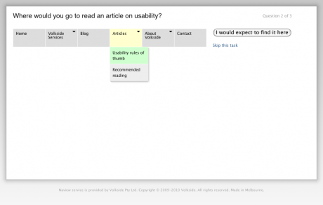
- Improved keyboard access on survey response screen. Your current selection is highlighted in green and the drop-down menu is left open whilst you’re ‘tabbing’ around for your next selection, or navigating to the ‘I would expect to find it here’ submit button.
- Improved colour contrast for the drop-down menu and parent menu item arrows.
Thanks to Ben Boyle for his feedback on how to improve accessibility!

